Street Address
City, State, Zip
Phone Number
No good idea goes to waste
Your Custom Text Here
WEBSITE REDESIGN
Community mapping in Kenya
PROBLEM:
Work as a consultant for Map Kibera to set the priorities of their website re-design and initiate my first web design project.
SOLUTION:
A modern and cleanly-designed website that more clearly showcases Map Kibera's methodology, successes, and final products to their various stakehholders while separating out archived information.
HOW THE ENGAGEMENT BEGAN:
Having interests in governance, rule of law, and accountability, I began attending brown bags hosted through OpenGovHub with a friend and former employee of Global Integrity. Open GovHub is a community of like-minded organizations who share a physical workspace in Downtown DC. While each tenant has its own individual charter, they work on a range of information and technology solutions for transparency, open government, and open data. Check out the innovators here.
At the end of one event, ICT for Open Contracting in Fragile States, I met Erica, co-founder of GroundTruth Initiative and Map Kibera. I'd been looking for an opportunity to get involved in this space, and to exercise my design muscles, and this seemed to be the right one.

GroundTruth Initiative “bridges open government and aid data with citizen monitoring by mapping, photographing, and shining light on the progress of (or often, lack of) local government projects in developing countries.” GroundTruth Initiative is a new media and technology consulting company specialized in community-based participatory technologies, especially mapping and citizen journalism, in poor and marginalized regions throughout the world. They design projects, tools, and websites to empower people to harness the potential of the Internet to guide their own development processes and become more active participants in democracy by amplifying their voices. They help people to use the Internet and simple digital tools to report on and speak out about issues they care about by using digital storytelling.
Map Kibera was GroundTruth’s first project. With the help of a grant through the UN Habitat Youth Fund, the members of Map Kibera Trust organized and trained youth members of three of the largest slums in Nairobi, Mathare, Mukuru and Kibera, on how to create the first free and open maps of their own neighborhoods and how to create media about their communities.

DEFINING THE PROBLEM SPACE
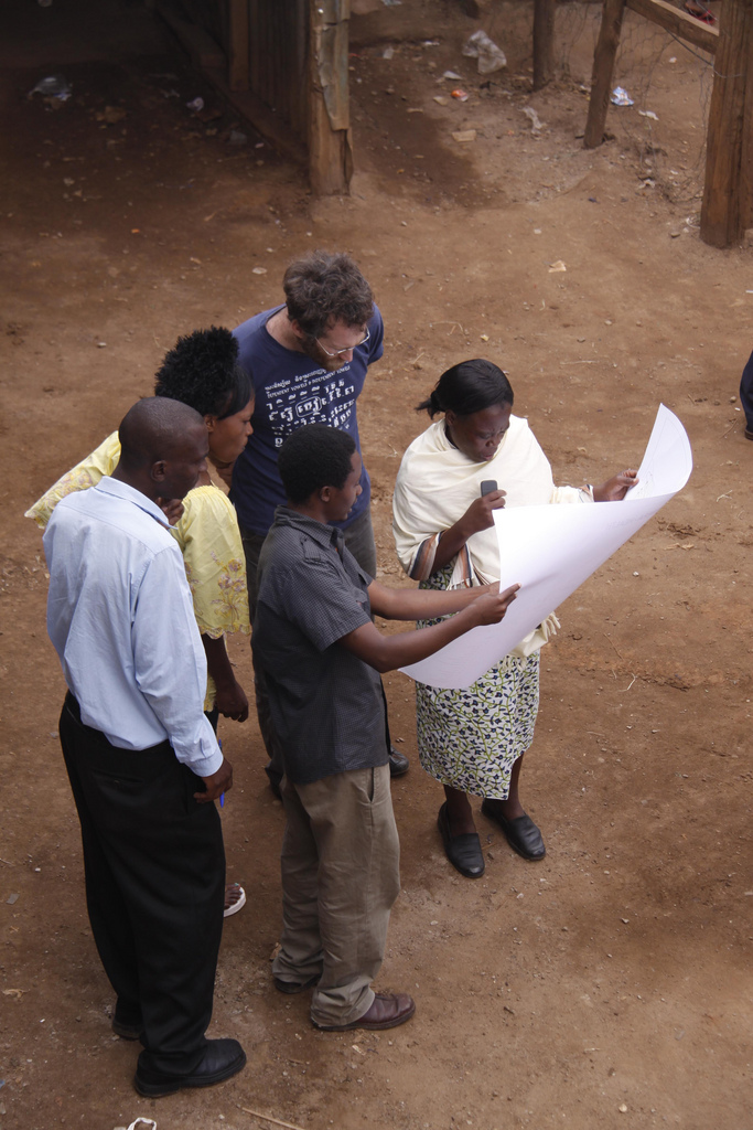
After surveying MK and GT’s web footprints, their websites presented themselves to be a good starting point for collaboration. I met with Mikel and Erica for lunch to understand where they wanted to go with them and what exactly they wanted to convey. It was important to completely hear them out before I peppered them with questions about the mission and goals of MK and GT and their sites’ usage patterns. I’d come prepared with initial ideas for content, as well. It turned out that they were struggling with a number of communication issues.
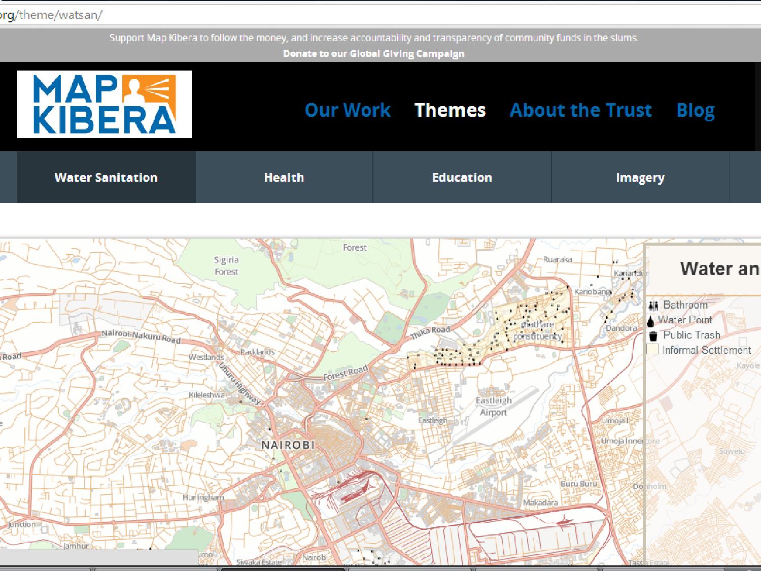
They wanted more visibility for Map Kibera’s largest projects – mapping, Voice of Kibera, and Kibera News Network – which at the time being, were only identified by name near the top of the home page. These links directed the reader to the projects’ individual sites but didn’t convey their relationship to Map Kibera Trust. I saw this move as a missed opportunity. We could better introduce these projects to the reader and emphasize their importance.
Skills employed:
- Consulting
- Web design
- Information architecture
- Editorial strategy
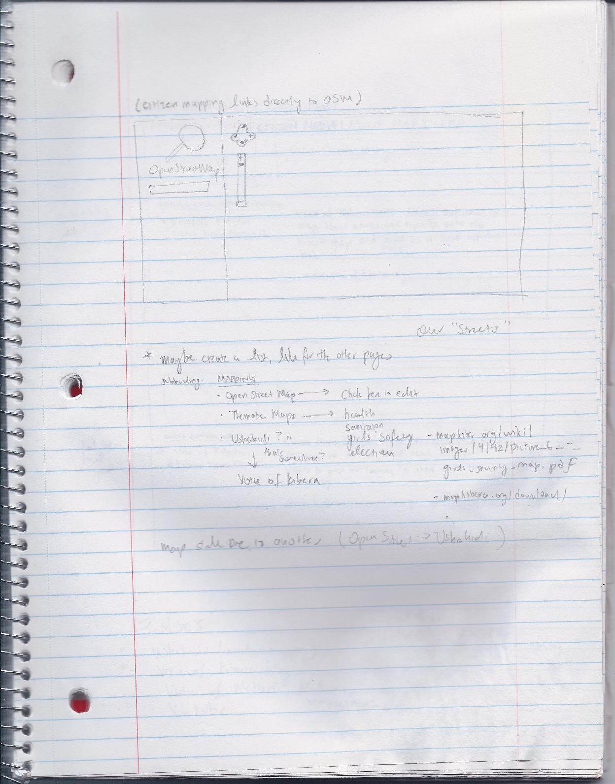
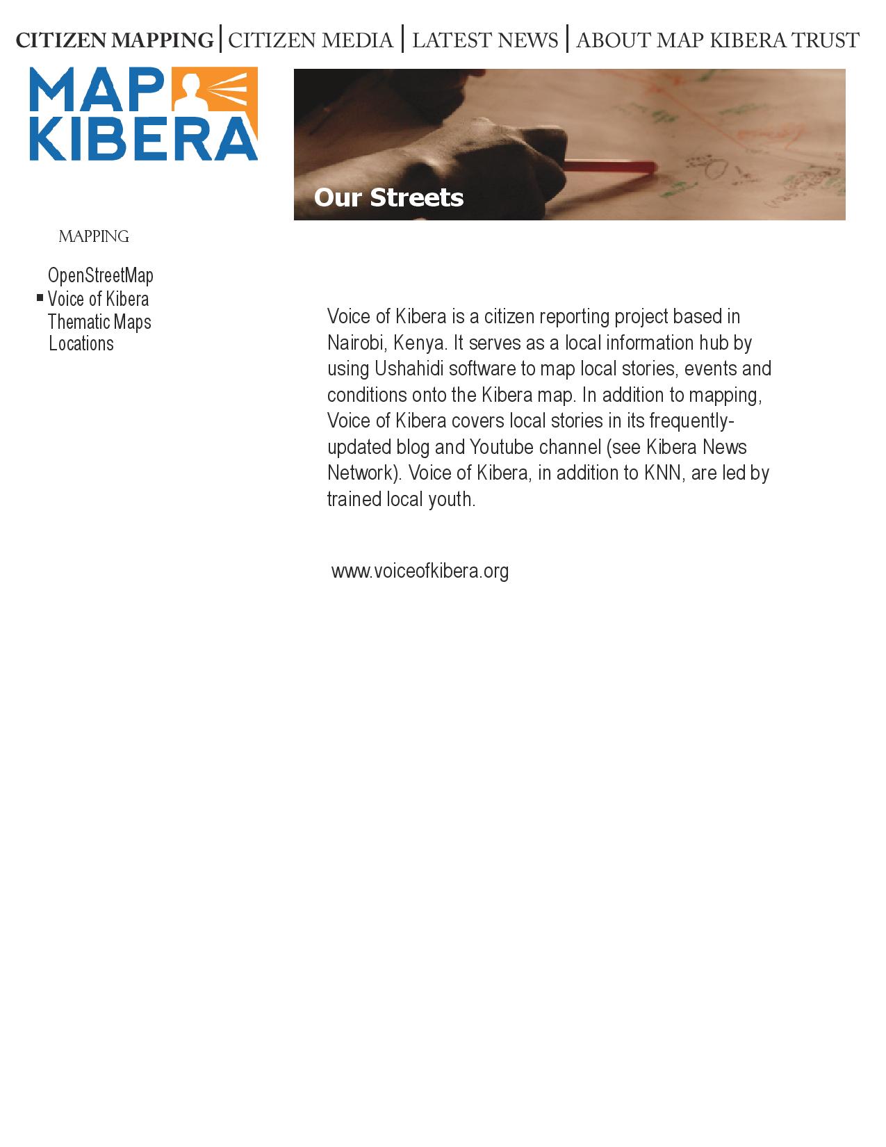
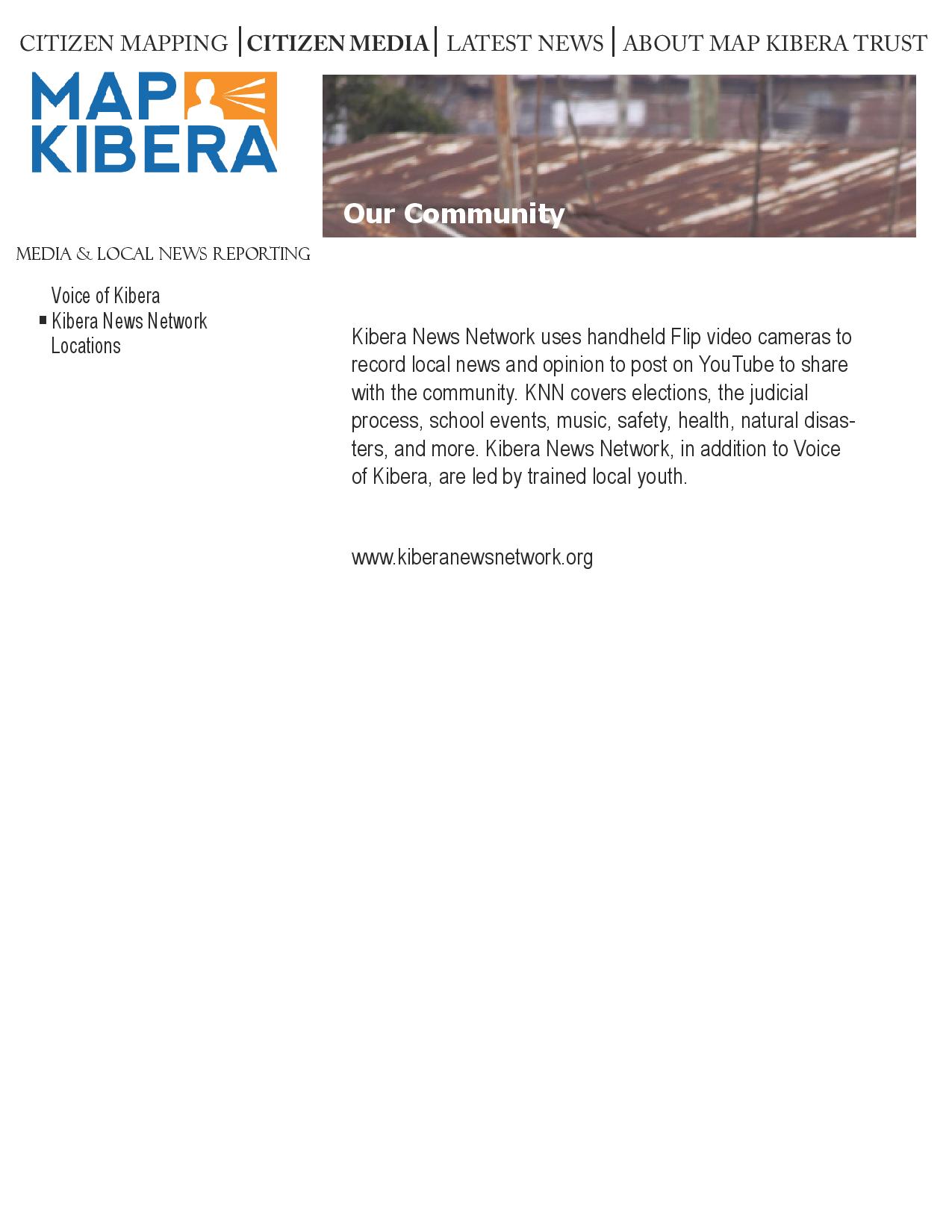
(In simplified terms, OpenStreetMap is a collaborative, free, open source map of the world with over 1 million registered users. Voice of Kibera is Map Kibera Trust’s citizen reporting project that aggregates local reports, community-generated media, and other relevant news. Kibera News Network is Map Kibera’s video journalism program that covers local news and features the “untold stories” of the Nairobi slums).

In addition to highlighting these three Kibera-based projects, Mikel and Erica wanted to feature the work of Mathare and Murkuru, two neighboring slums who had their own related maps, blogs, and YouTube channels to show. This would complicate the task of creating a hierarchy
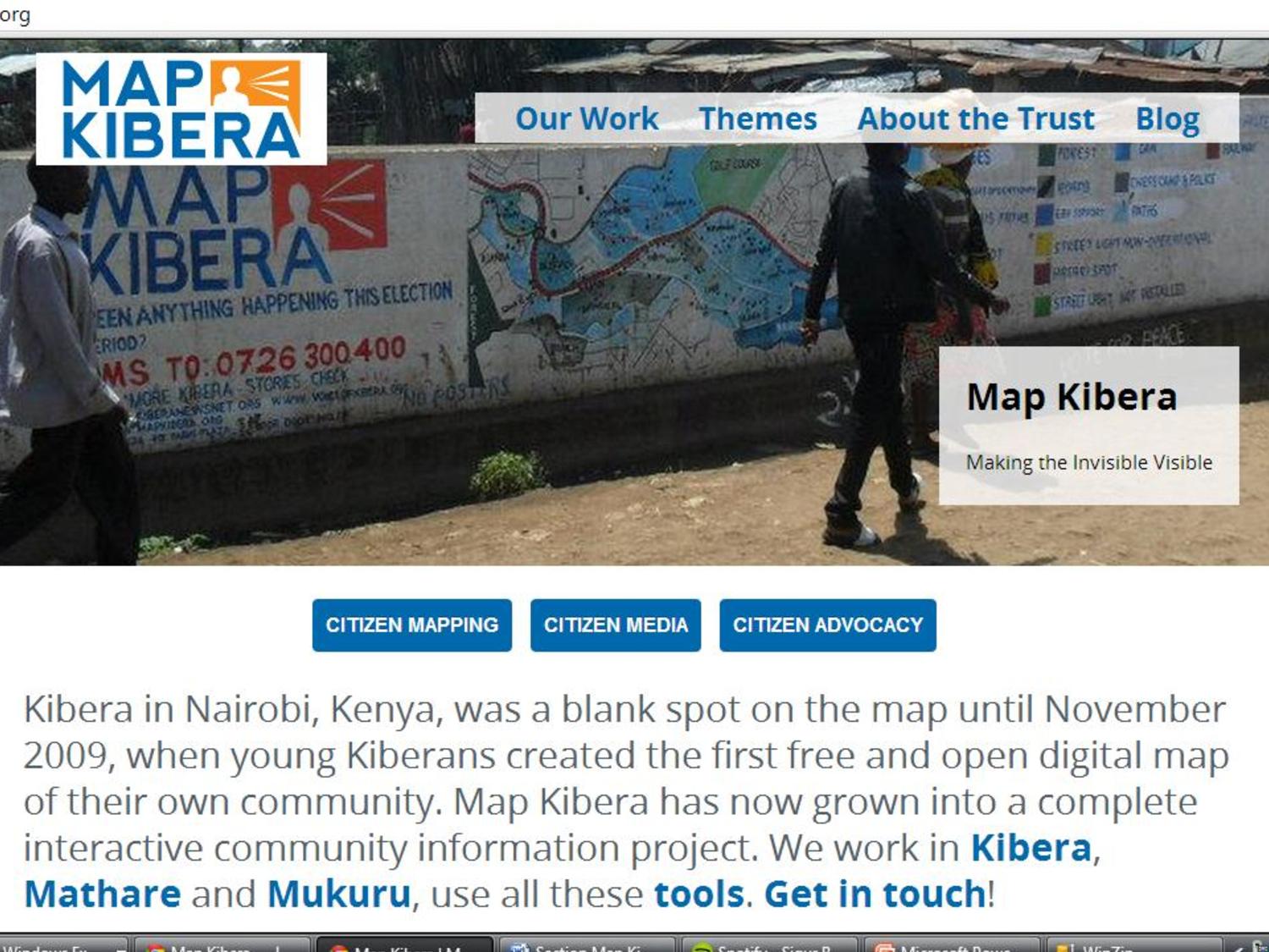
Other noticeable observations. The site welcomed you with this great, punchy summary of what it was, but left you to your own devices after that. The home page was essentially a launching pad for much of Map Kibera’s work: projects, plans, wiki, blog, and data.
With all that information outright, and a handful of redundancies, the site made it difficult for the user to know what important and as such, hid opportunities to better learn about the Trust’s operations and impact. My job was to focus on cleaning up the site’s organization, focusing its messaging, and solidifying the branding of Map Kibera Trust. I was to make sure the user left the site with a clear picture of the Trust and its related programs.
You can see the site here.

PROCESS
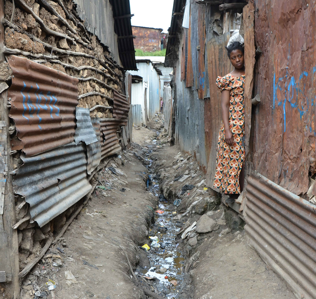
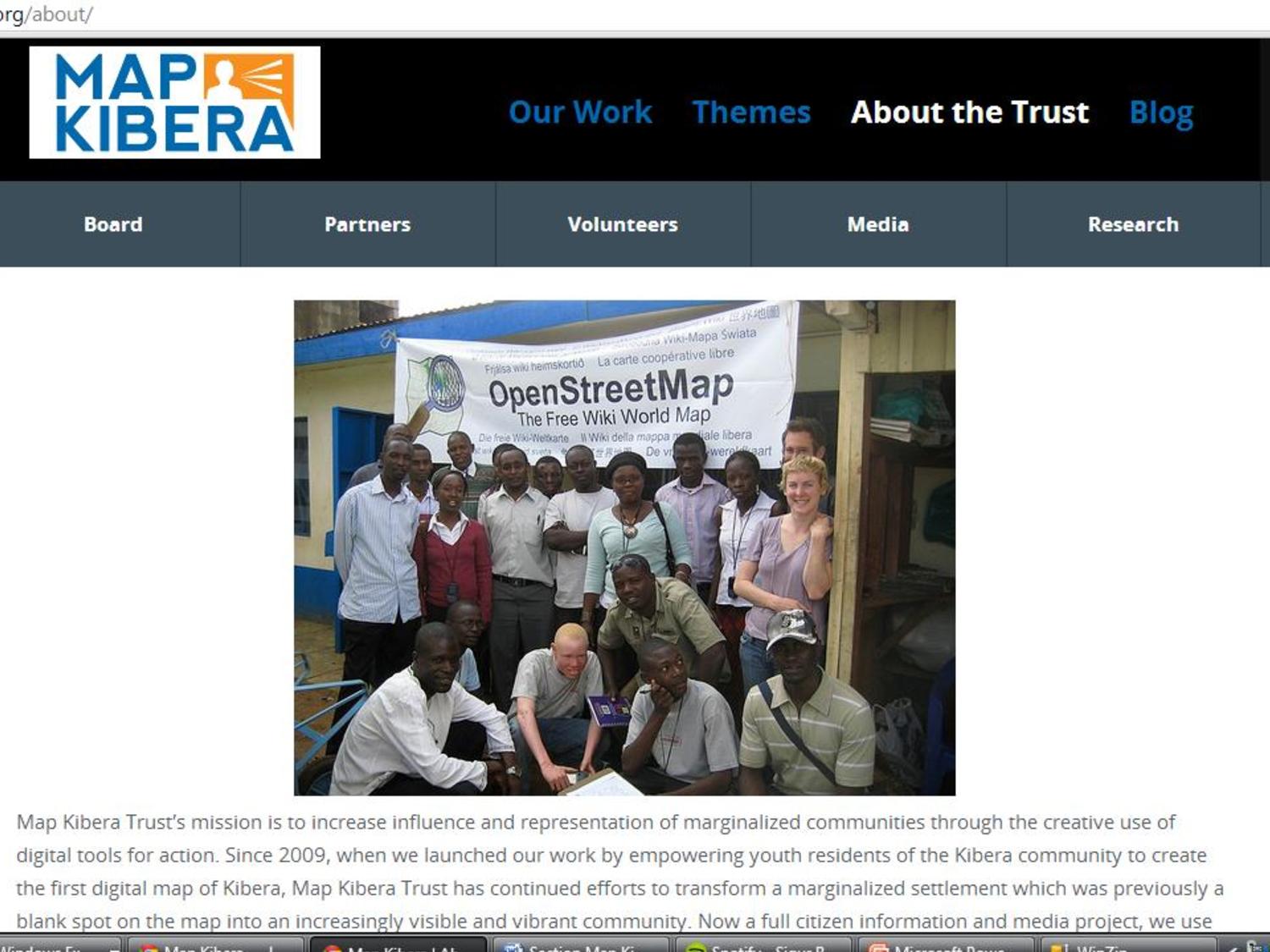
The very first thing I did after we met was to go through Map Kibera’s Flickr-published photos to get a feel for what Kibera itself like and what the work there resembled. The photographers who took the shots were involved in the project so the photos themselves would give me a sense of how the participants on the ground viewed things.
The most striking photo was a wall that had been painted with a security map—this was before I made the connection that Map Kibera had used offline maps, in addition to GPS’s to collect geographical information. The painting was a community outreach program that involved many groups and provided vital security information during the last general election. It was especially significant to visitors and even locals who were unaware of some political hotspots and unsecure places in Kibera. Fun fact: a Kiberan youth painted the map. (Read about the many challenges, including wall security, identification, and ownership here).
The wall signifies participation, persistence, and community. What better way to start the journey into the site?
CREATING AN ENTRY POINT
Originally, I envisioned a site with a simplified top-bar navigation that would serve as an umbrella to the rest of the site.
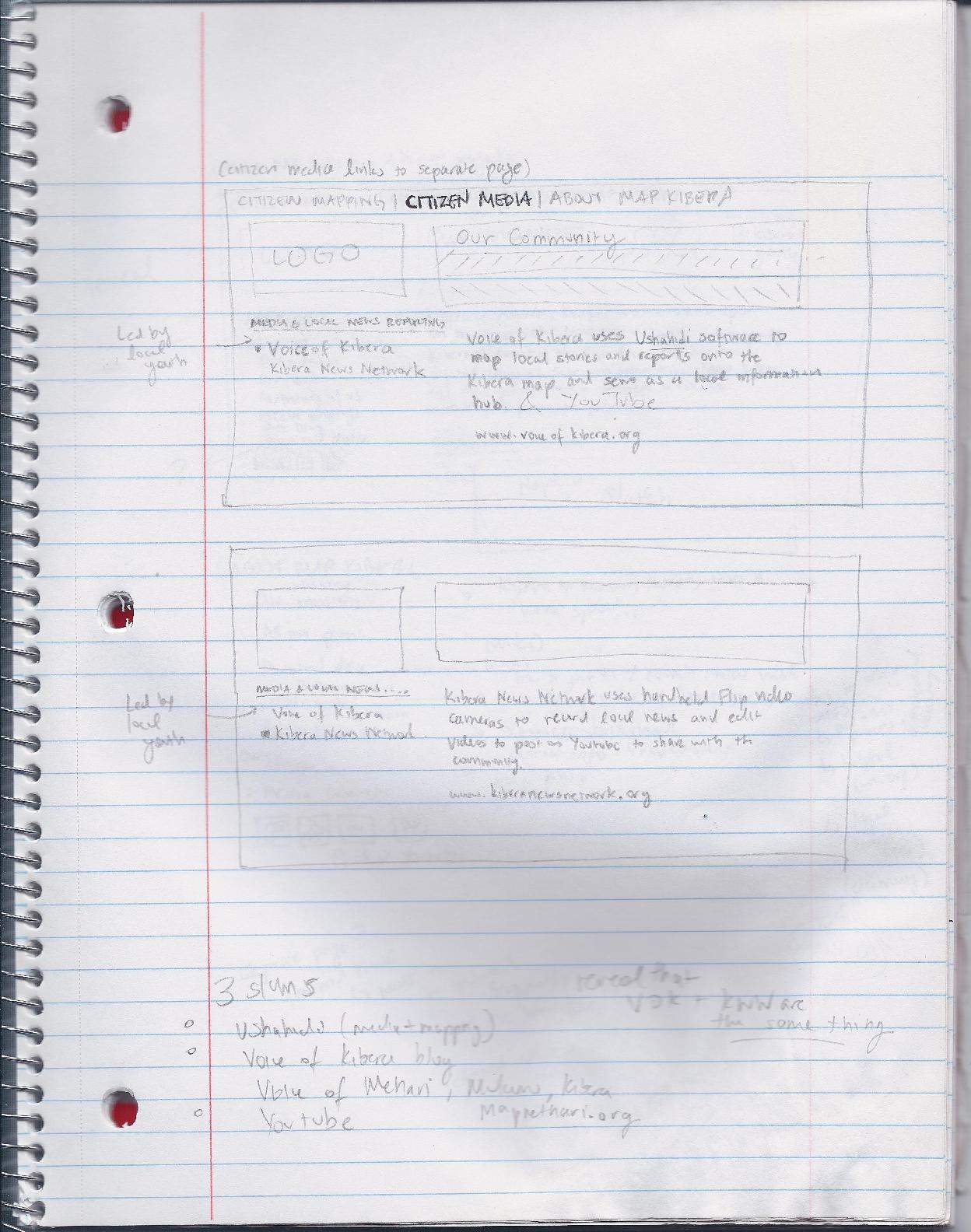
I’d like the sound of “citizen mapping” and “citizen media” from the initial page because they tapped into the reality that the maps, blogs, and YouTube materials were all user-generated. So I pulled those into my re-design and added a third catch-all category, “About Map Kibera.” Between the specific messaging and the picture of the wall, I wanted the user’s experience to provide an accurate snapshot of the community, and I wanted that snapshot to feel unified and all-encompassing. Mikel liked the idea of four links for navigation, keeping it nice and simple. The fourth was his suggestion, for Map Kibera’s blog, which featured the organization’s most recent news.


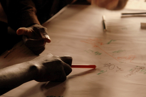
I prototyped the rest of the layers by pencil before graduating them to Adobe Illustrator, the first program I'd learned in the Adobe suite. At the time, I knew nothing of wireframing tools.
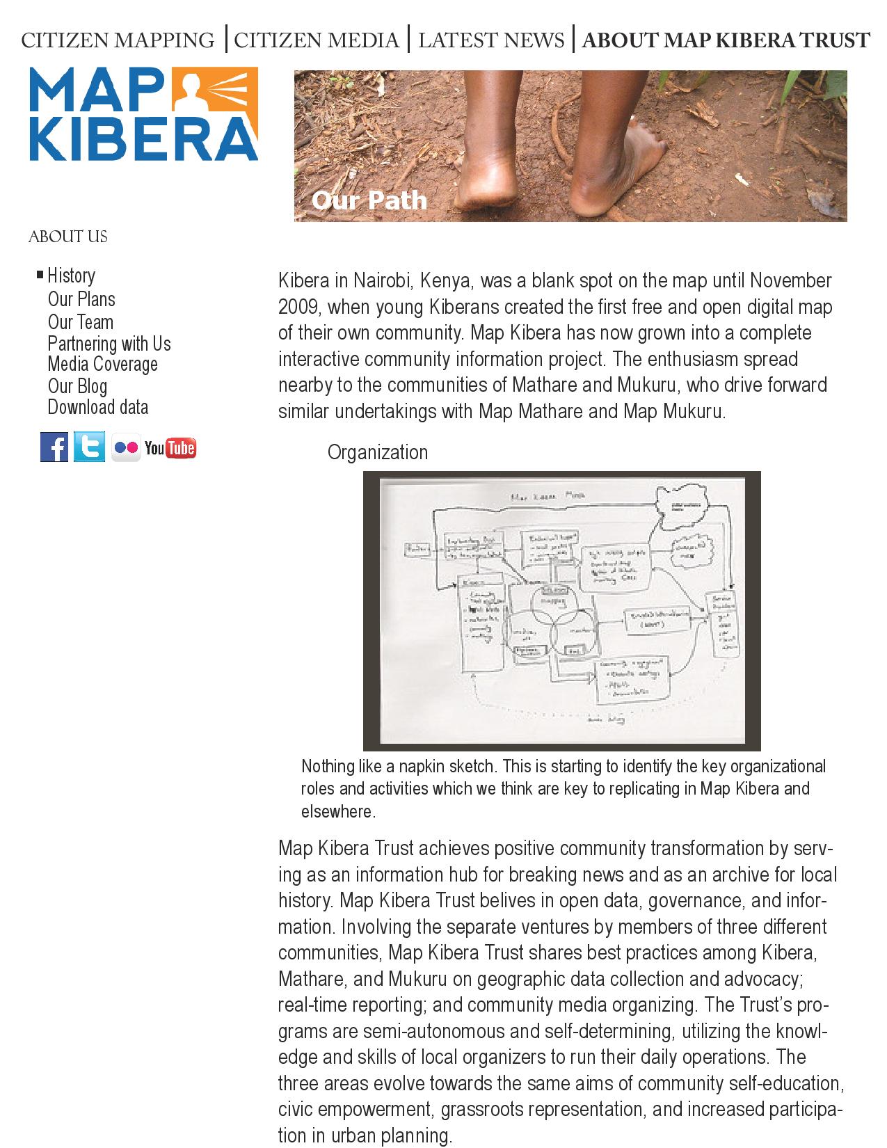
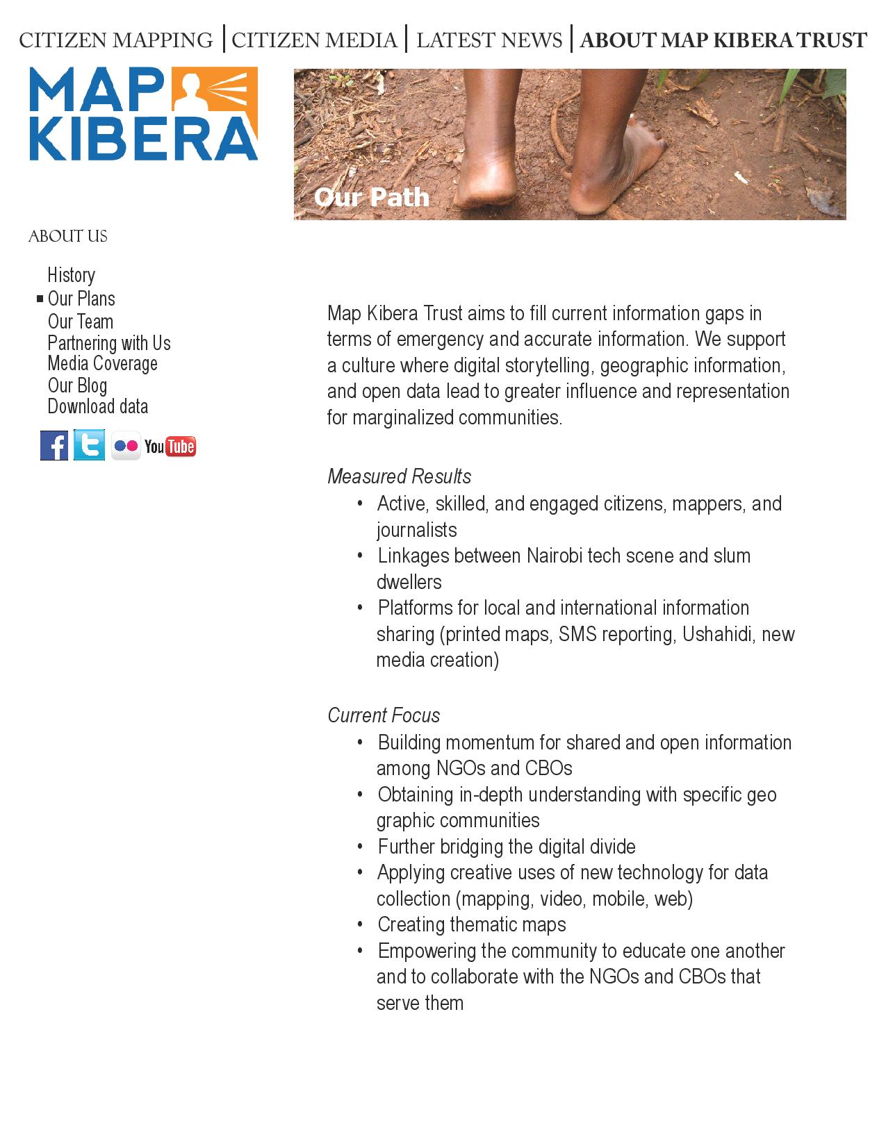
Citizen mapping, Citizen Media, and About Map Kibera would be the three levels to categorize the rest of the information. To reinforce this consistency, and to strengthen the sense of ownership that belies Map Kibera's ethos, I attached a motto alongside a picture of each of these three themes, to be featured to the right of the logo. For Citizen Media, this was "Our Streets" on top of a hand-drawn offline map. For Citizen Media, it was "Our Community" inlaid on a roof to communicate three metaphors: a home, a roof, and oversight. For About Map Kibera, this would be "Our Voices" next to 13 youths to indicate the future of Kibera, the future of the project, and as you would later learn, the dominant role of youth in leading the project. I later swapped this photo with one of bare feet on a dirt road, with "Our Path" inscribed because this section would cover the history and make transparent the plans of Map Kibera. Erica brought up a good point--we shouldn't use pictures of children. This would confuse visitors by suggesting to them that the NGO was education-based.
As I’d mentioned earlier, I wanted the new site to better highlight its tools of engagement. Sure, let’s visually separate them by giving them their own section and tab, but I wanted to introduce them, show them off, not expecting the user would sustain enough interest to click ownwards, then press the backspace to rewind, then to click on a second tool, and etc. Let’s keep things concise and to the point, so to encourage you to go on our merry way.
ADDING COMPLEXITY
Now comes the time to discuss the inclusion of the other project sites.
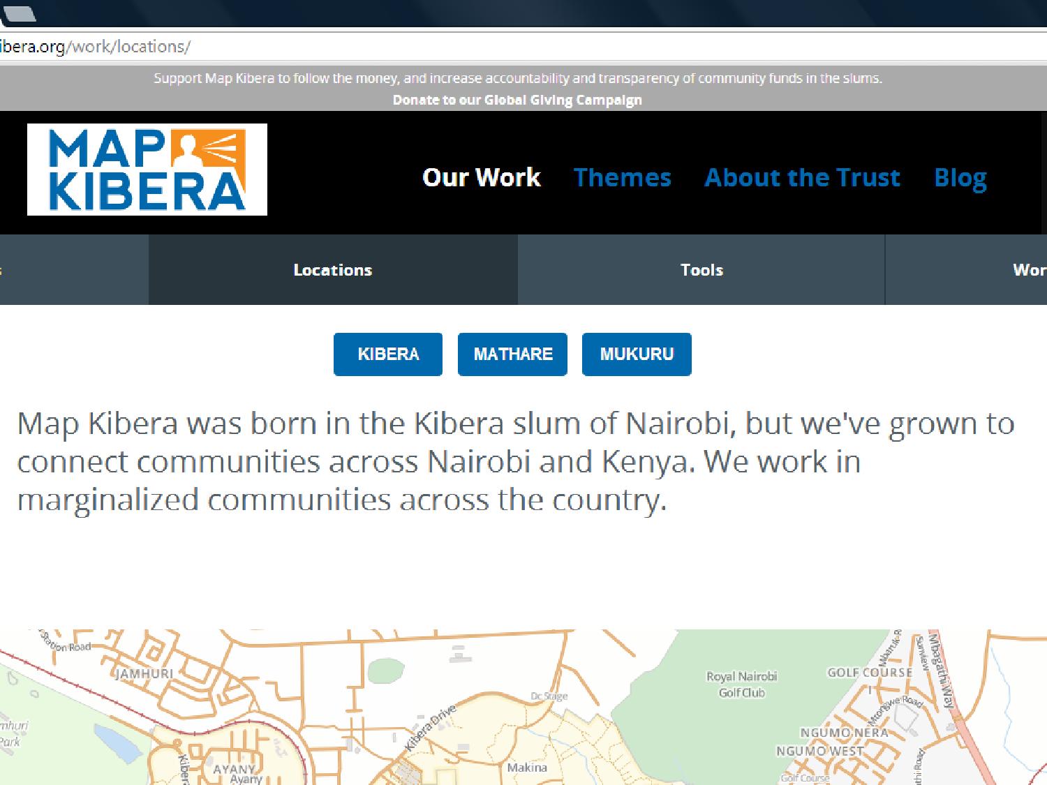
The lefthand navigation would show you the tools under each project headline. My first idea was to have a “sister projects” page that would discuss the parallel initiatives in Mathare and Mukru. This would be underneath all the tools cited, and this page would explain that these other projects existed in these places, how they were related to Kibera, then provide you links to Mathare and Mukuru’s projects, in the same way that we offered the links after the introductions for Kibera. The founders didn’t love the sound of “sister projects,” so we shifted that label to “locations” for the time being.
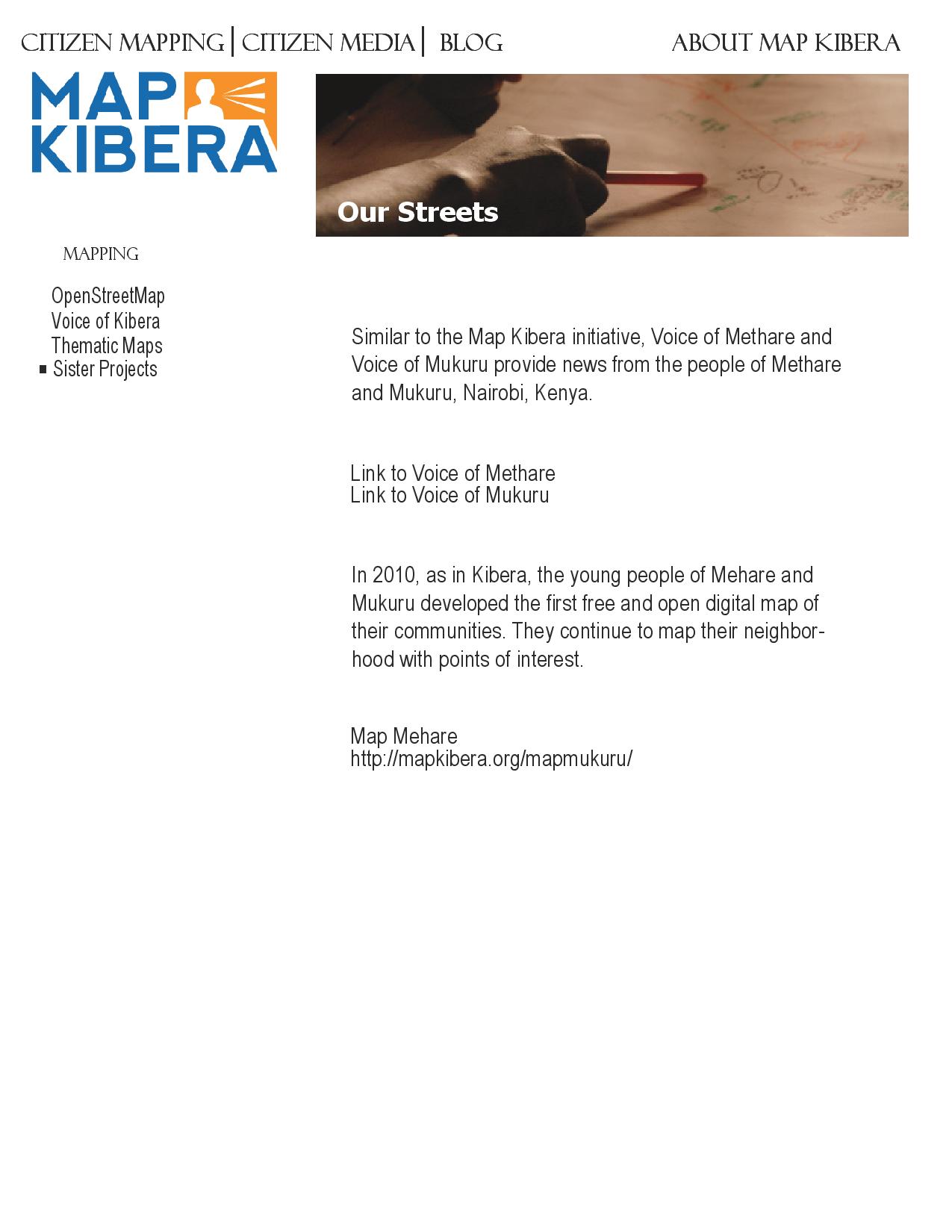
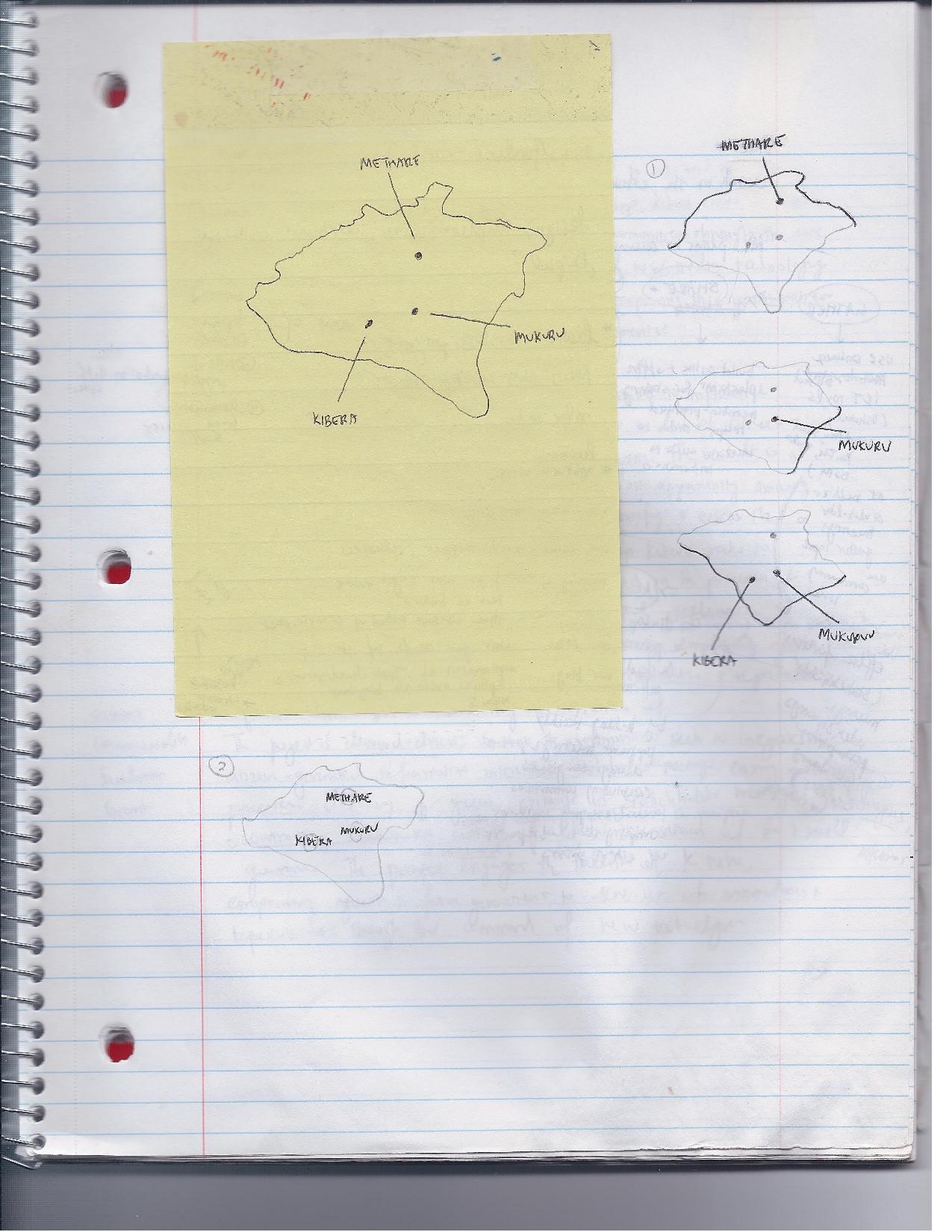
After milling around on the page, I thought – hey – let’s add a visual aid. Until this point, no map outside of the OSM extract of Kibera was shown. Mathare and Mukuru are in Nairobi too, but where in relation to Kibera? Most people who haven’t spent time in Nairobi, or who have, probably don’t have an idea, so let’s give them a mental model to help them remember the names of the three and a picture to aid in distinction.
This visual cue may prevent me from running Mathare and Mukuru together and lumping them into some "other" category. We could bold which area of the map we were discussing on a given page, and by giving each slum an equally physical space and label, we can convey that the communities are of equal weight. These maps could be “embossed” on all mapping and media sub-pages, with participating communities with that tool highlighted in blue. For example, mapping and blogging would have all three borders bolded; video just two.
Mikel agreed that a Nairobi overview map would be useful. But, as you’ll see later, Mikel and Erica made the decision to keep the user’s attention on Map Kibera’s methodology and de-emphasize the tools. That decision affected how we would incorporate the locations, and we later resolved it by acknowledging the locations in a separate location sub-page, and then more specifically underneath the relevant tools.
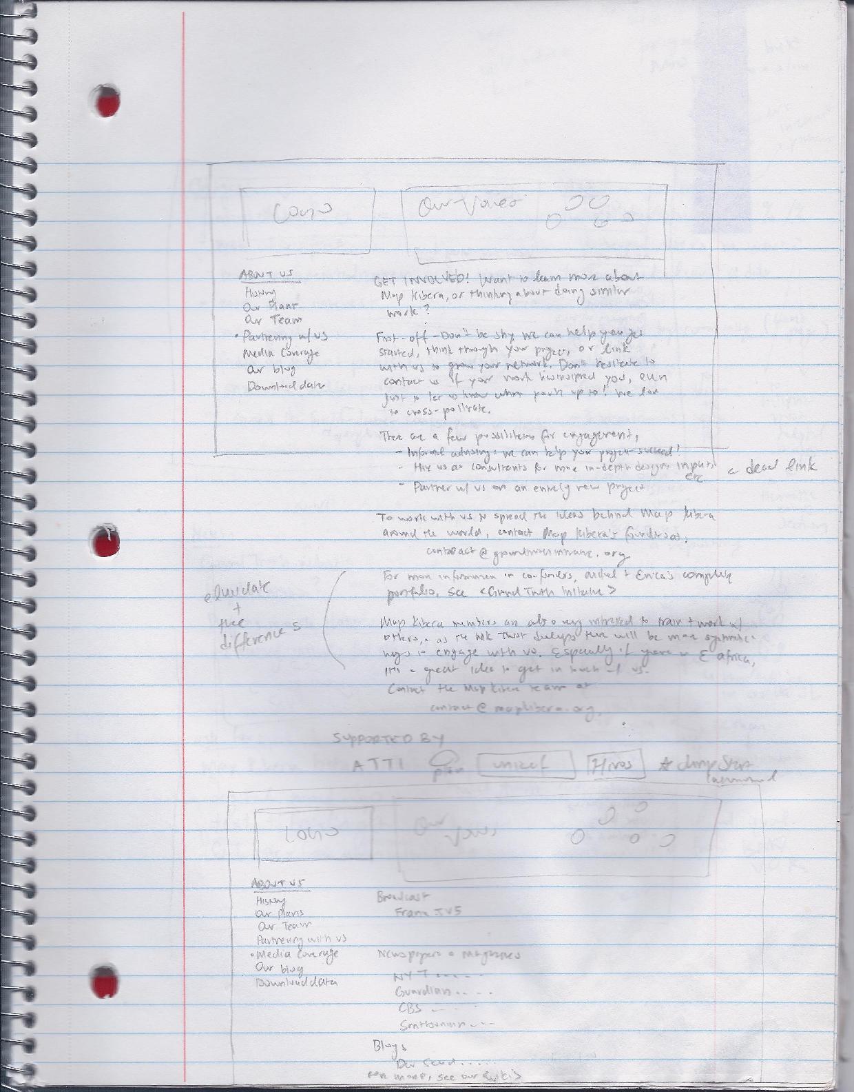
Since citizen mapping and citizen media covered the tools, About Map Kibera would get into the nitty-gritty of operations. The areas I felt the most valuable to single and put forward were History, Our Plans, Our Teams, Partnering with Us, Media Coverage, Download Data, Contact Us. These each would have their own sub-page.

I felt like it was imperative to give Download Data, Contact us, and Partnering with Us their own sub-pages. These parts didn’t need to be visible on the home page but should be prominent elsewhere. Map Kibera could better market and share its data and comment on its open source, open data philosophy. Partnering with Us didn’t need to be visible on the home page either and could be given its own space. Here we could also invite more partnerships and draw the distinction between Map Kibera and GroundTruth, and which you should contact depends on whether you want to work in Kibera or do similar projects elsewhere. Contact Us should follow the same standard all other sites use, so people know where to find it – which is to keep it in the upper right of a web page. These pages were to maintain the conversational, friendly tone that Map Kibera uses, one that invites collaboration and values a dogged commitment to the can-do.
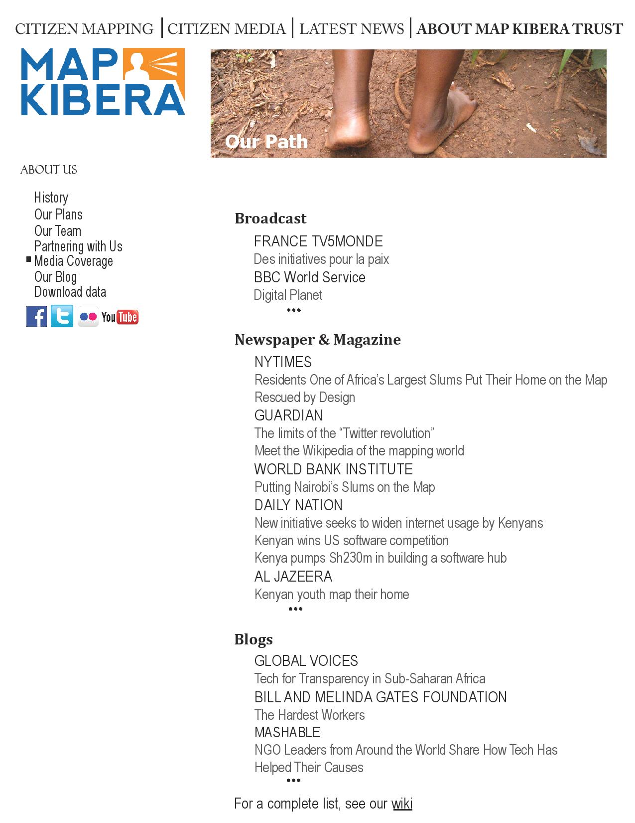
The newest ideas were to include sections on History and Our Plans, which would borrow from the Wiki and have a description of the mission, an organizational map, and next on the agenda. The Wiki also gave birth to the idea of a section for media coverage. Map Kibera has been featured in three dozen publications, talks, or radio announcements – how could we hide the publicity, credibility, and accolades the organization has achieved?
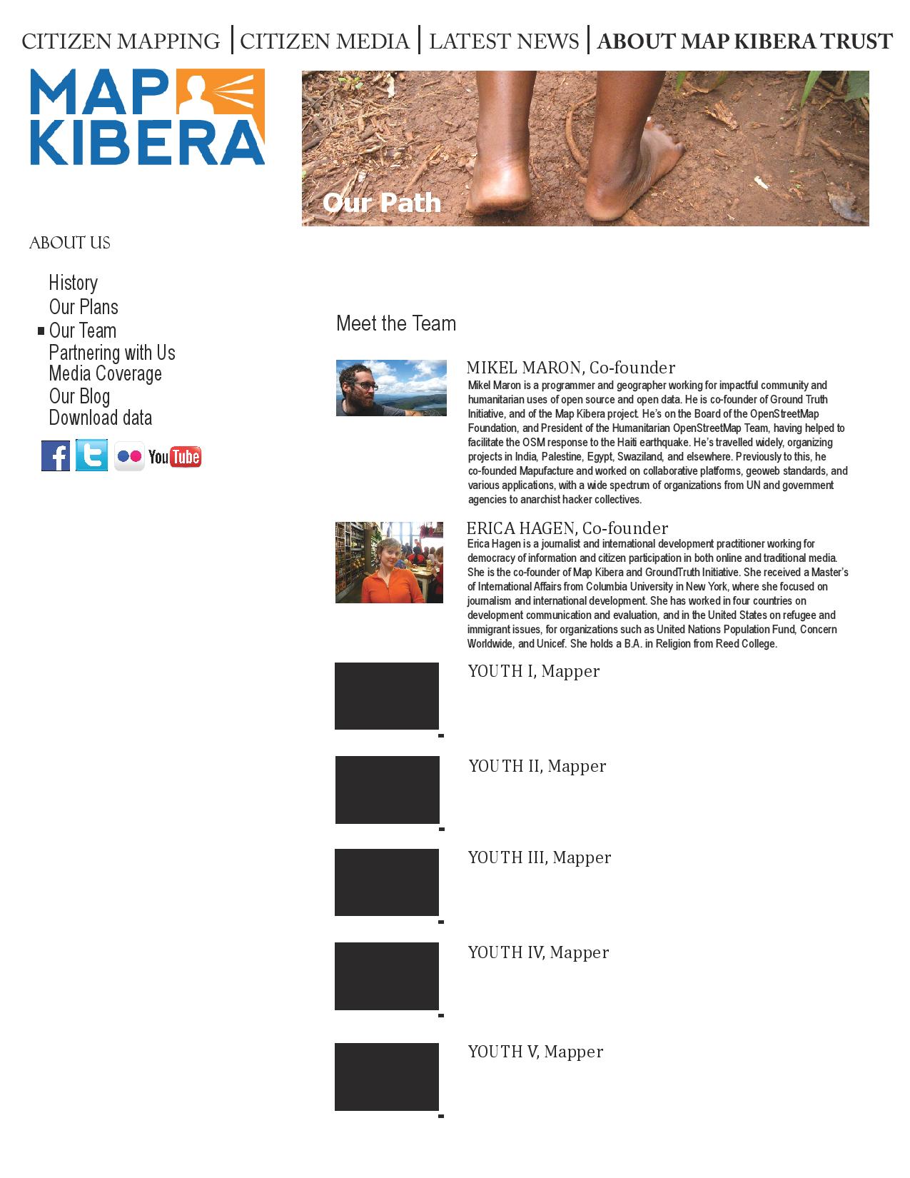
Mikel and Erica wanted to have a page for all of Map Kibera’s managers and volunteers, with descriptions of each of them. This would be a good place to do that, so I created an "Our Team" page.
I felt that it was okay to ignore some of the home page items as well. We can exile Facebook, Twitter, and Flickr to the base of the “About Us” column, below the list of sub-pages, so they could be consistently found in the same place, on multiple ages. The link to the wiki could be siloed into “Our Plans,” no need to put it anywhere central.
After I’d presented my ideas through the pencil sketches, I got some feedback and then agreed to return with the digital mock-ups. After reviewing these, we went through a couple more rounds of improvement. Mikel said that my efforts helped un-stick some of his thinking – a big relief for me, this being my first interface design project. He and his developer would work on the coding, and I’ve noticed several of my ideas embedded in the results.
SWITCHING GEARS
Somewhere in between I received an email from Mikel saying that Erica and him had re-thought their strategy and wanted to de-emphasize the different tools of engagement (mapping, voice, video) and instead talk about the approach to their methodology. This would help solidify the connection between the three slum areas and unite the separate initiatives.

Ugh, but you get the idea!
I gave some thought as to the methodology page and how to convey the mission and intent of Map Kibera. Heavily inspired by a previous grant to Commonwealth, I wrote some copy and modified what I’d formerly intended for the About Page. I thought it wise to touch upon the main points I kept reading about in the Wiki and through grants, such as slum-specific issues, how national and international agents attempt to address them, how local communities can be involved in improving the aid process that is indeed centered around them and how Map Kibera creates a feedback loop between local, national, and international agents.
I designed something of a flow chart which shows my amateur command of Illustrator at the time. Admittedly, at the time too, it was an eyesore and the fonts were just too dark and…wrong—but I think the idea was right. A diagram is helpful in understanding a feedback loop.
See the outcome of that page here
GOING LIVE
By now we had a beta version of the site running, and Mikel and James, our developer, transitioned the site from Drupal to WordPress. I went through the site and verified that all the links worked, and up it went!
OUTCOME:
The site was well-received by the clients. The home page received more hits and experienced a lower bounce rate in the following months.
Disclaimer: all photographs used on this page are the product of Map Kibera Trust. None of these were taken by me.